Keeping in mind the exponential growth in the use of mobile devices in recent times, global brands are scurrying to integrate responsive designs to their business websites in order to give users smooth browsing experiences across all platforms.
But, what exactly is a responsive website design? How does it feel and look like?
To start with, it is important to know, even though the terms ‘responsive website’ and ‘mobile-friendly website’ appear to be synonymous, they are not quite the same.
Essentially, a mobile-friendly website looks really good on a mobile phone, but it might have glitches and snags on devices that have a higher resolution, for instance, a tablet.
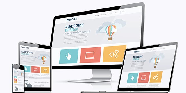
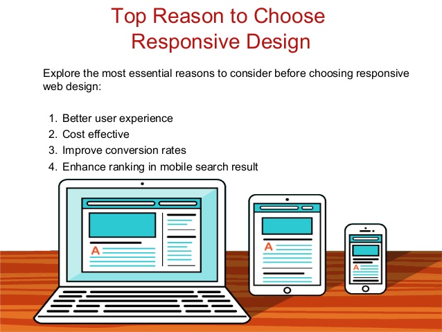
On the contrary, a responsive website design is optimized for any screen size. It automatically adapts to the device’s screen, irrespective of whether the device is a desktop, a Smartphone, or any other platform.
This article illustrates the cutting-edge advantages of applying a responsive design to your website.
Responsive website design
Increased Traffic
There was a time when enterprises created two different variants of their business website – one for the desktop, and another one for the mobile.
There are many, who still follow the practice even today.
However, nowadays, it is not a good policy to adopt, as maintaining two different versions of the same website can be a high maintenance, as well as a time-consuming routine.
These days, as the digital landscape is witnessing a dramatic shift from desktops to mobiles, it would be beneficial for brands to have a single website that is ready and responsive to all devices.
A responsive website design enables superb navigation capabilities on any given platform, which brings the users back to your website whenever they are in search of a product or service you offer.
Ultimate User Experience
This is probably the biggest benefit that is triggering the switch towards responsive website designs.
Websites that are unresponsive usually have no issues when viewed on a desktop, but the same cannot be guaranteed for all mobile devices.
It has been observed that an unresponsive design often distorts the appearance of a website when viewed on a smartphone or tablet.
Images don’t align well, texts are muddled, and users have to take the pain of scrolling through endless web pages to look for the information they actually need.
To avoid embarrassing scenarios like these, it would be rewarding for enterprises to consider a responsive website design that heightens the ‘in-site’ experiences of their users.
Easy Adaptability
Another great benefit of having a responsive website is that it automatically adapts to the screen size of any device, especially the newer ones, making possible to seamlessly cater top-quality content over next-generation gadgets like smart watches and IoT devices.
With a future-ready, responsive website design, companies can catapult their brand miles ahead of the competition.
Improved Search Engine Optimization
The increasing adoption of responsive website designs can be greatly attributed to the benefits they leverage in improving the ranking in search engine result pages (SERPs).
Google openly suggests a responsive website design, as it enhances user-focused experiences and enables the delivery of rich, high-class content across all devices.
High-quality content and heightened experiences make users stick around on a website for extended duration, dramatically increasing the dwell time, which, in fact, adds to an organization’s search engine optimization efforts.
In the long run, owning a responsive website that is ready for the future, can help businesses hold on to more customers, eliminate annoying downtime, and save a significant amount of money by cutting down frequent maintenance.